Case Study: Kid Lab
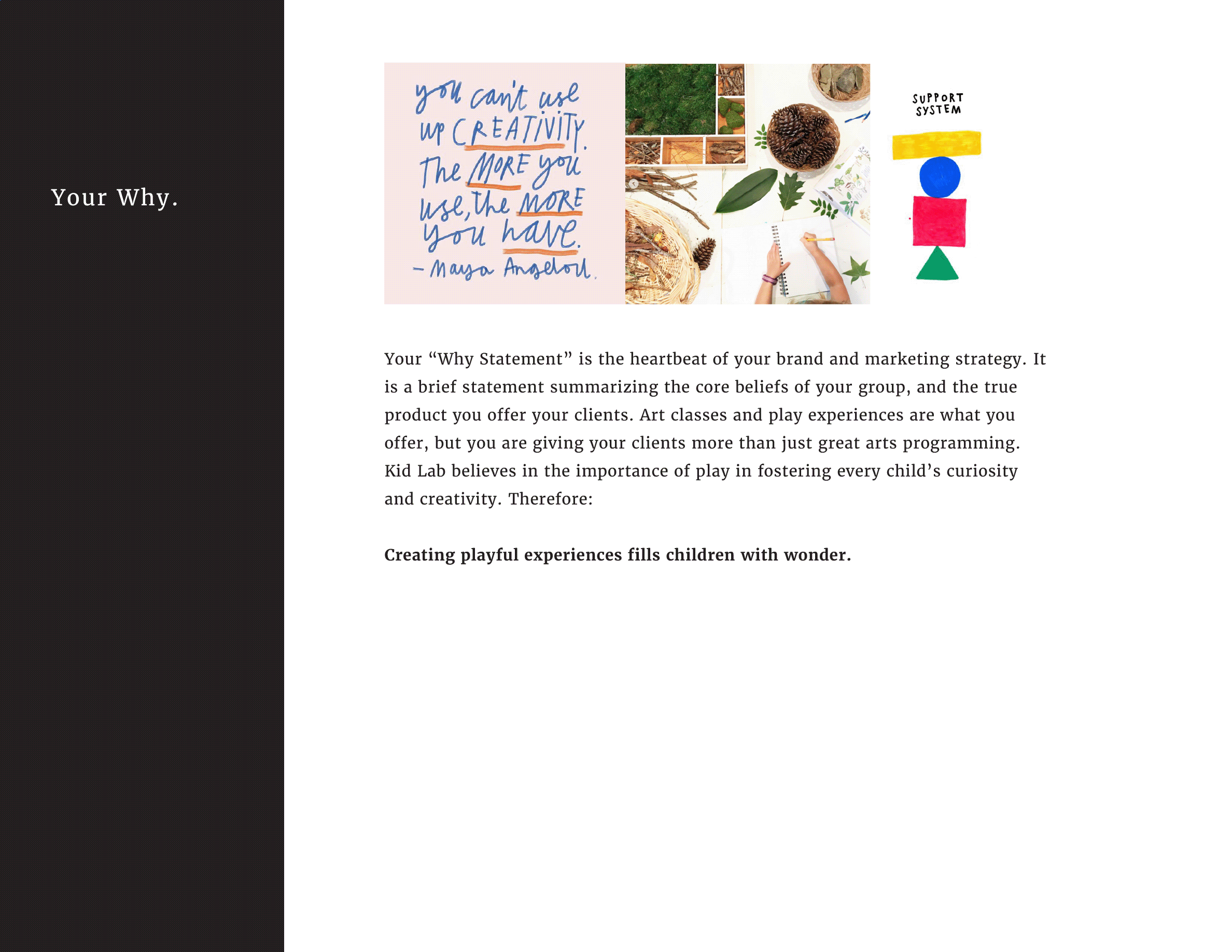
Kid Lab is a not-for-profit space where kids learn through intentional play. Owner Shannon Newby is an artist and educator who believes every child should have a safe space to experiment, get a little messy, and ask big questions. Shannon approached me to design a brand strategy and logo for Kid Lab that reflected the earnestness of her “why” and the creative play that is her hallmark programming.
Discovery & Brand Strategy_
Research summary & brand strategy deck.
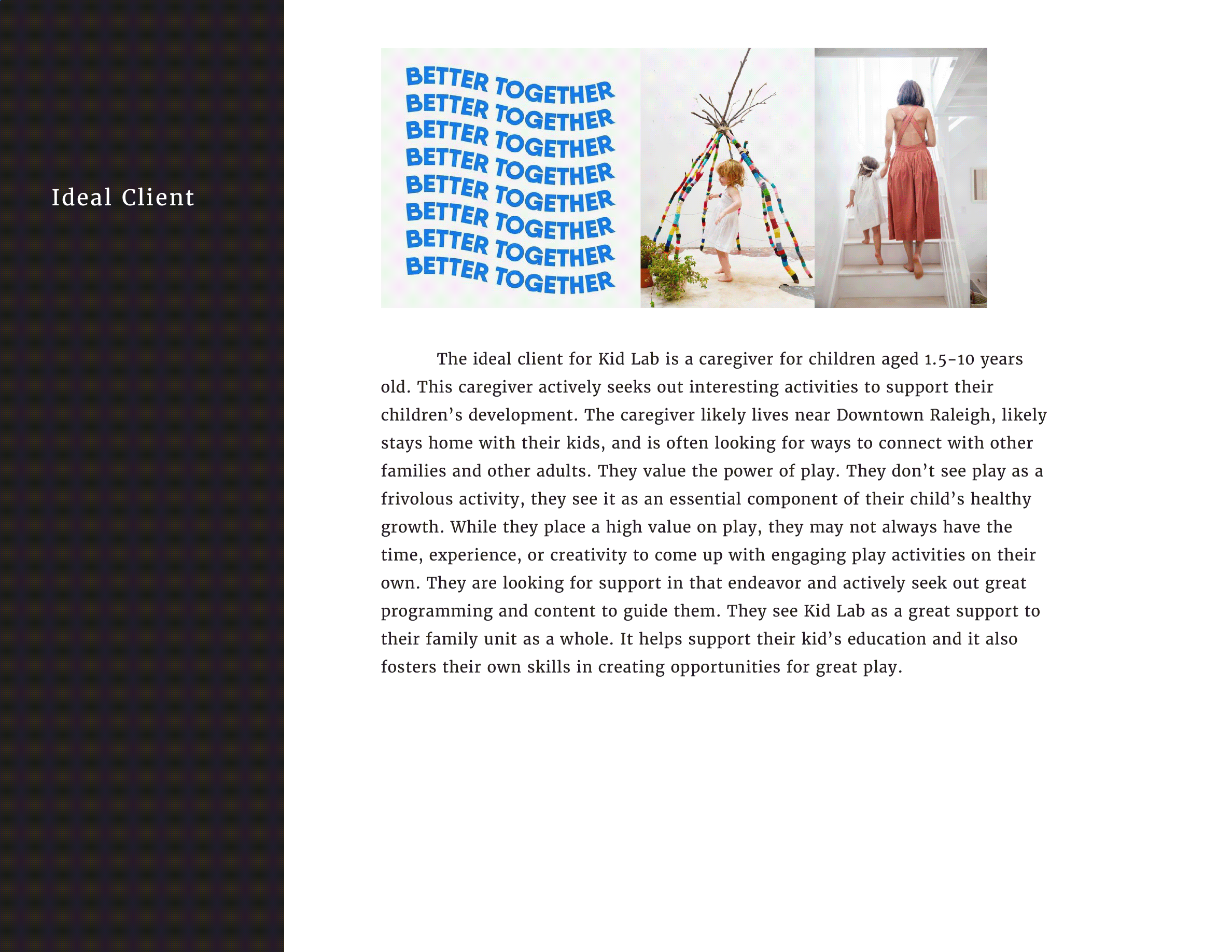
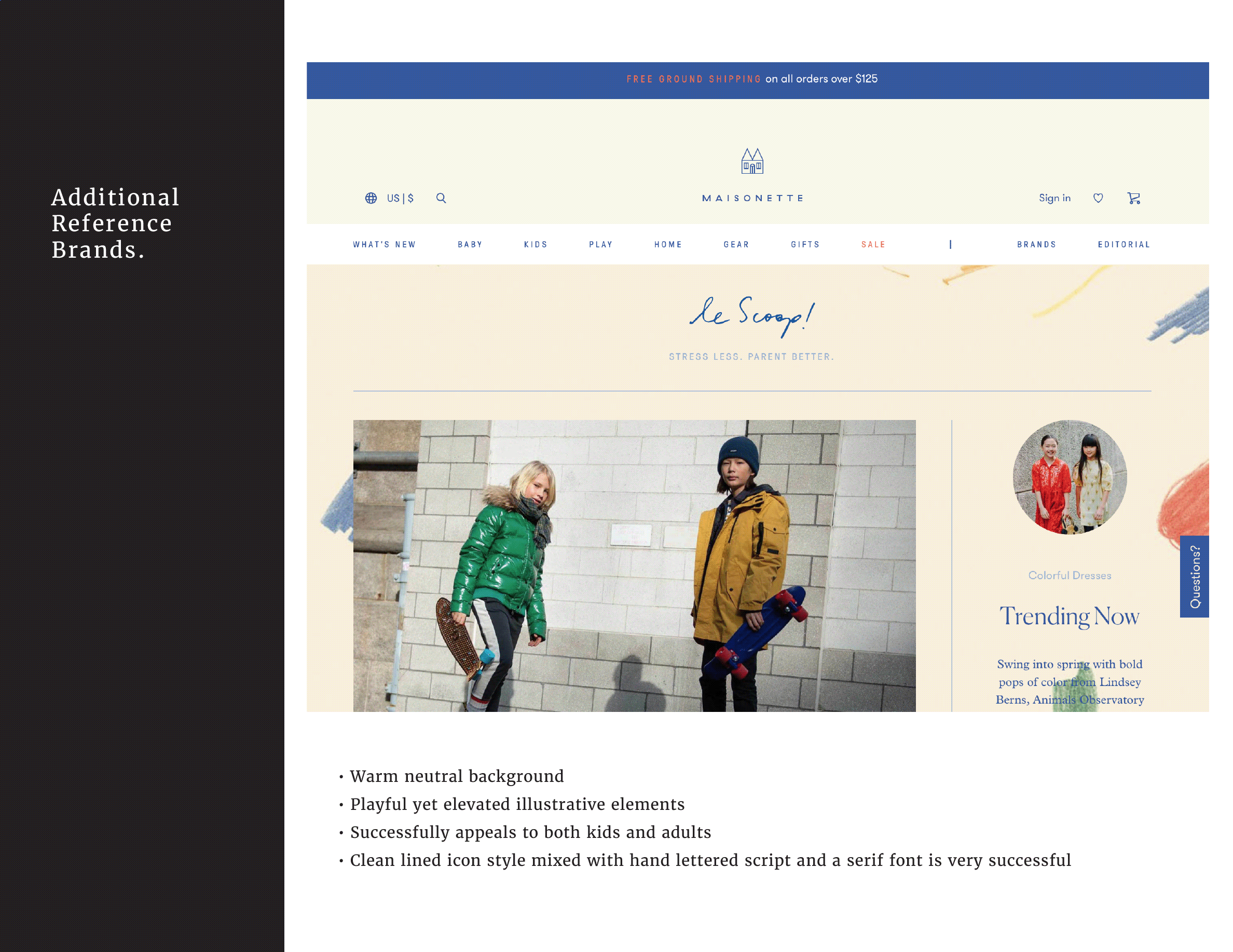
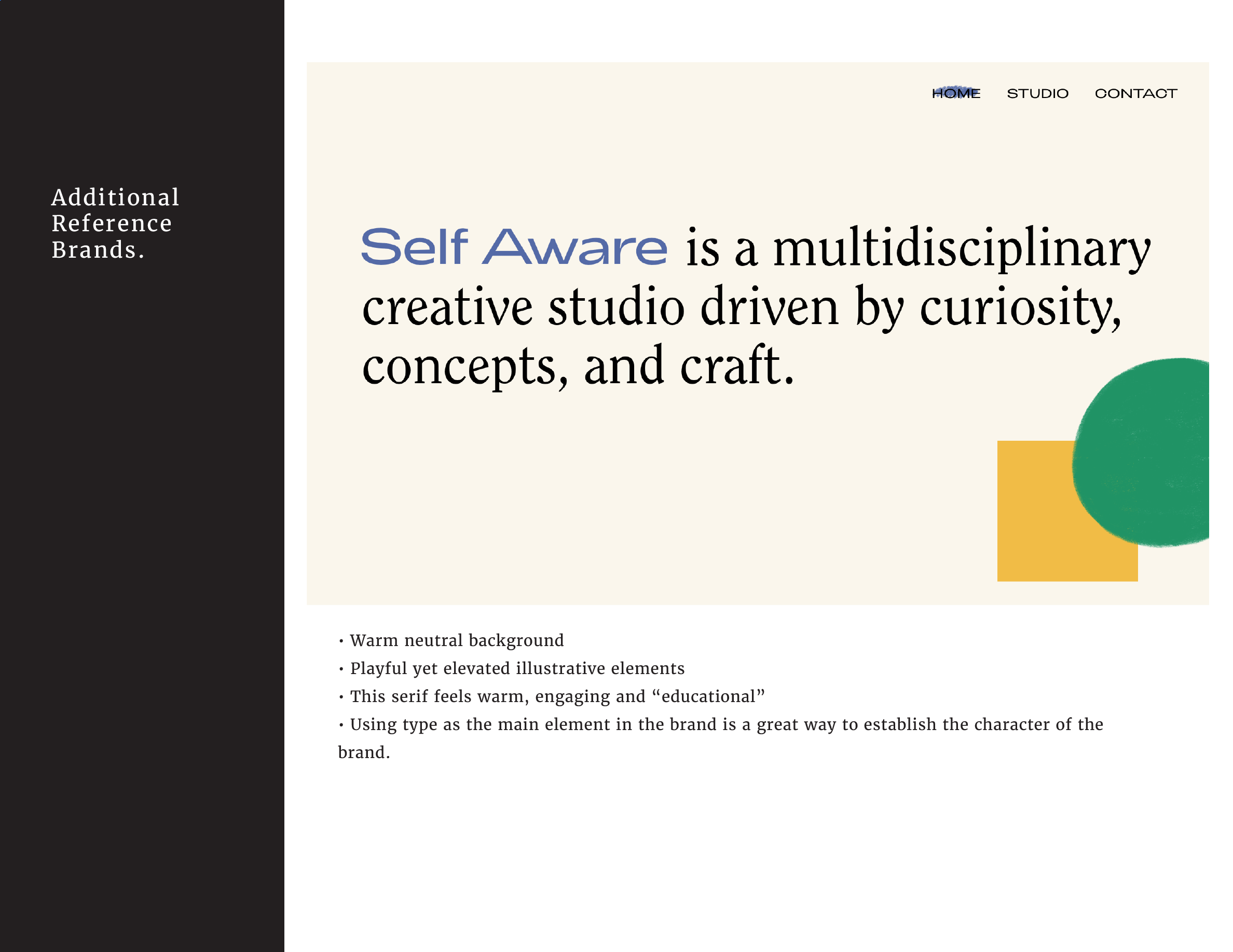
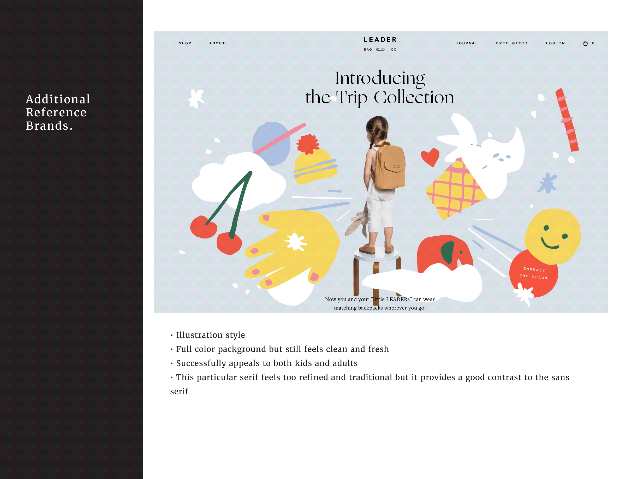
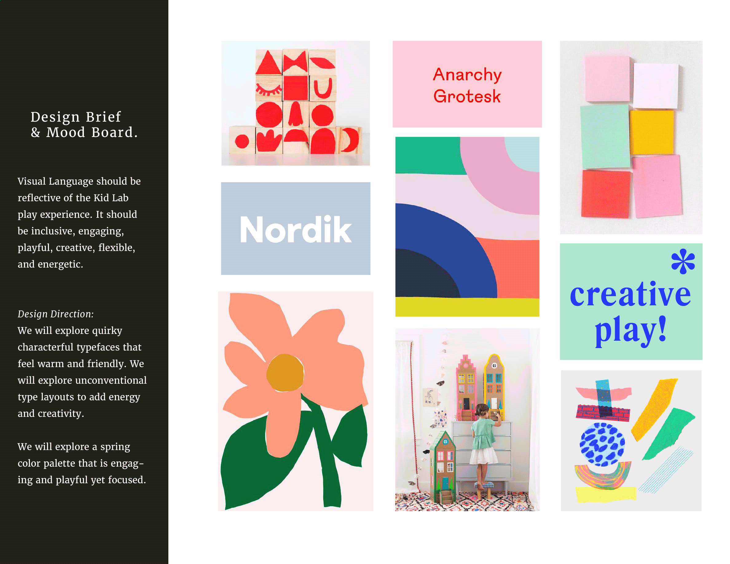
At the beginning of the strategy process, Kid Lab was struggling with how to position the brand in relation to other local learn through play programs, and how to communicate the thoughtful philosophy underpinning their programming. It was important to Shannon that the brand feels welcoming to kids and families from every economic status, so it was critical that the brand not read as aspirational. By studying and breaking down other children’s brands, we were able to clarify the right way to position Kid Lab.
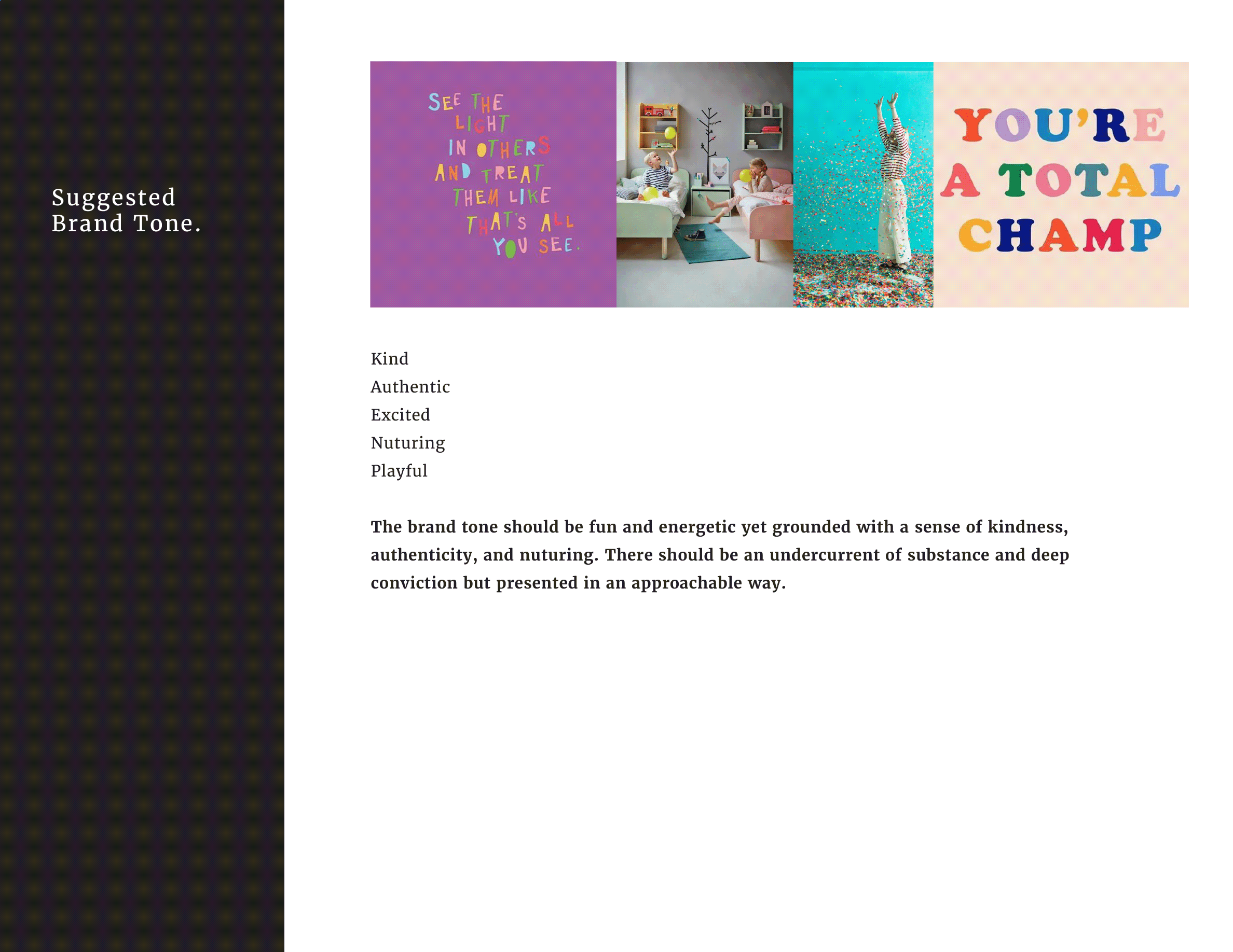
The final slide in the brand strategy deck was the design direction. Durning early discovery, we discussed the concept of Brand Seasons and determined that Kid Lab is a Spring. Therefore, we explored a bright, fresh, energetic color palette. While some primary colors are incorporated, pops of neon and grounding pastel tones ensure the brand has depth.
Logo Concepts_
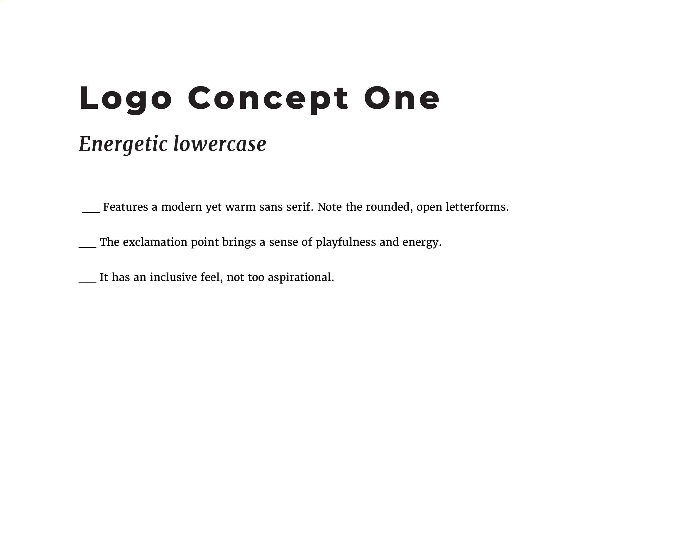
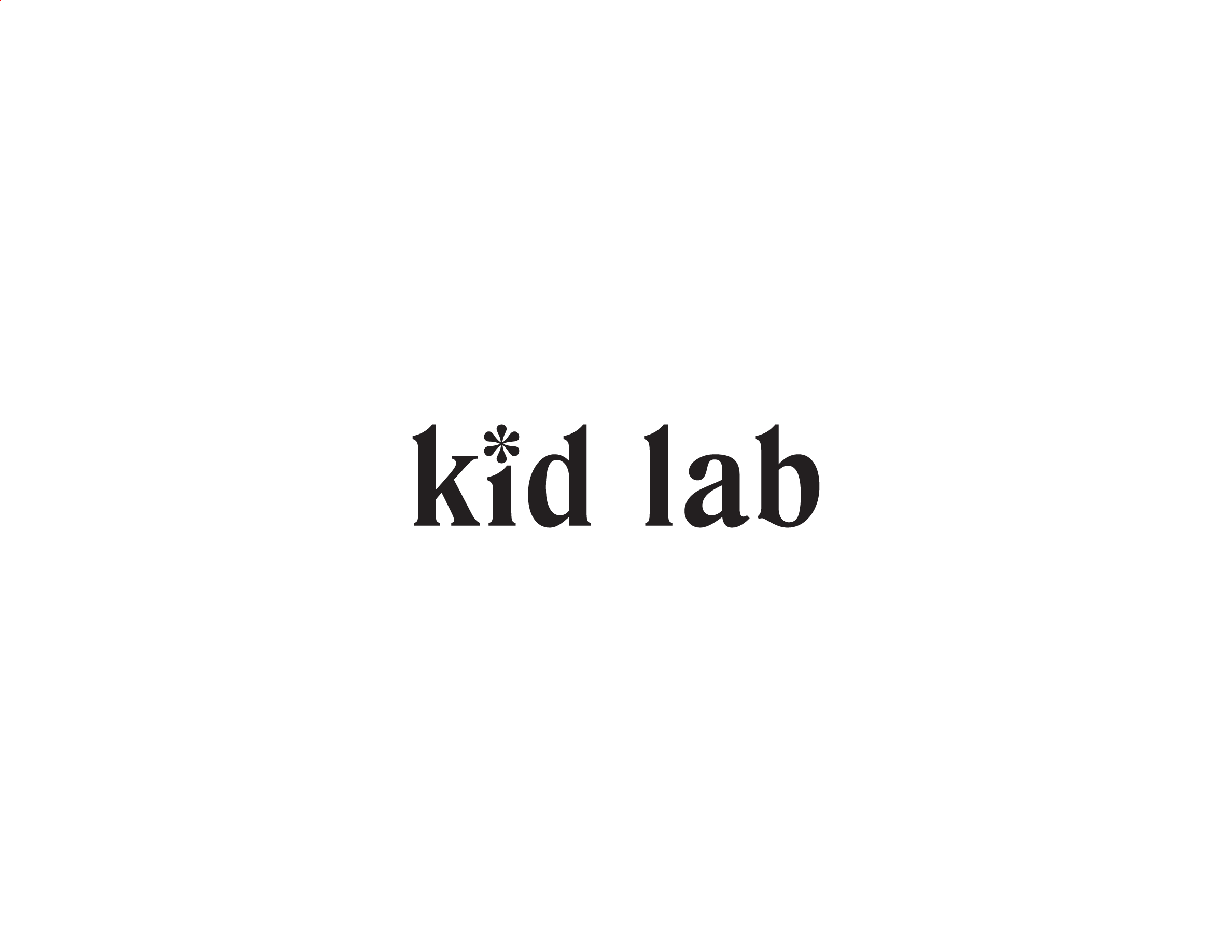
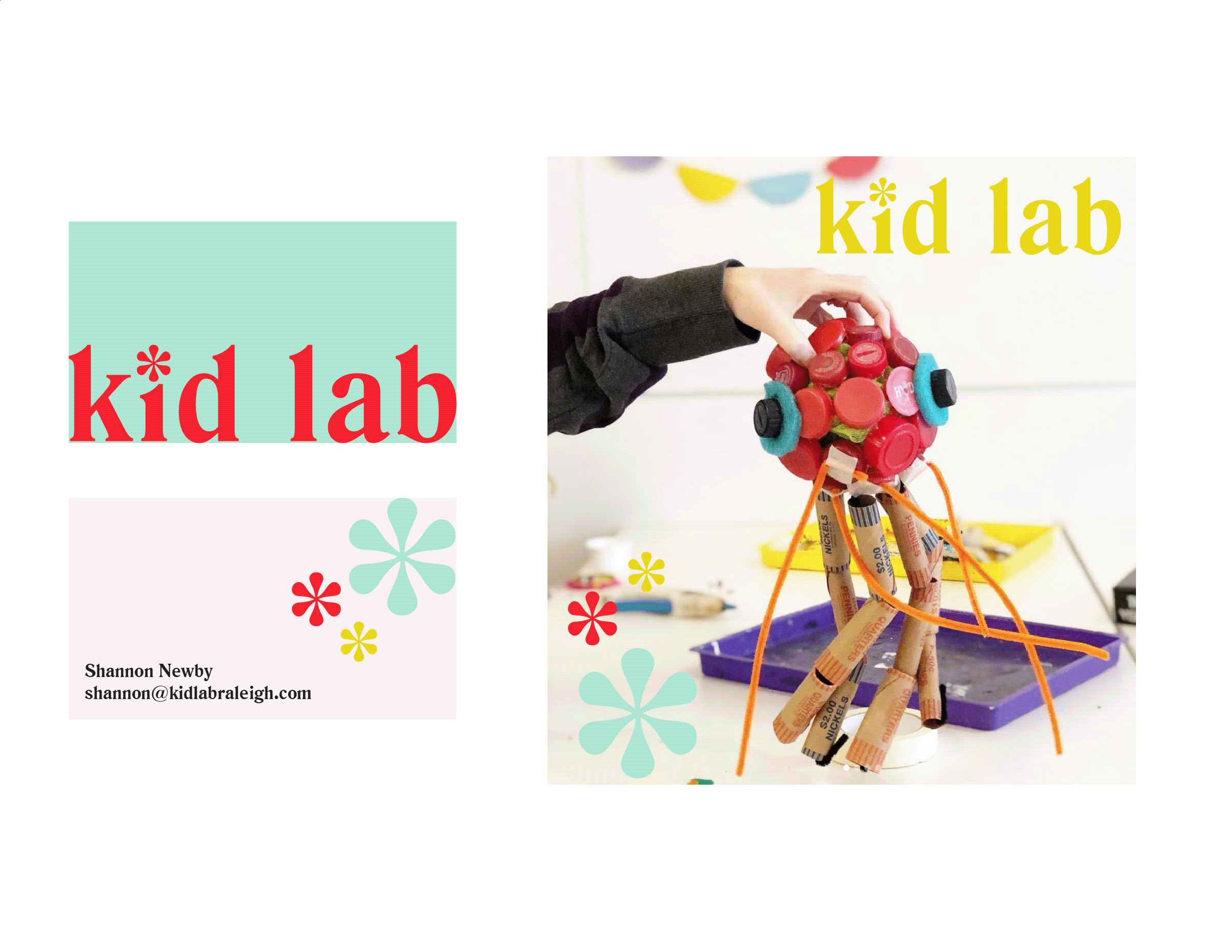
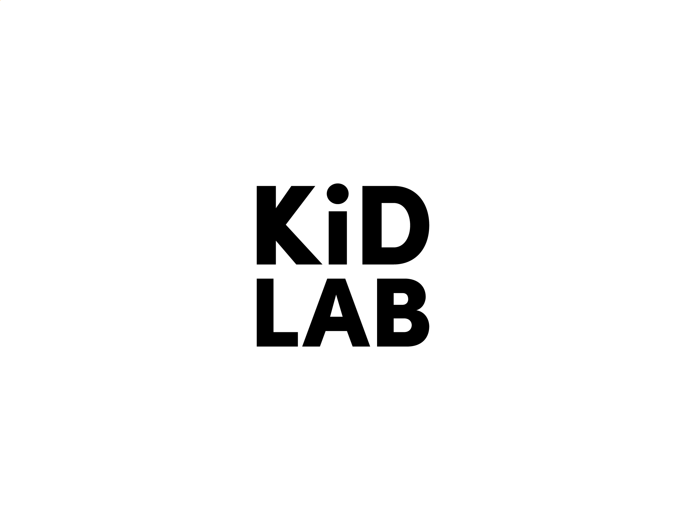
I presented Kid Lab with three distinct logo concepts. Each one explores the brand strategy brief by emphasizing certain aspects or keywords of the brand tone.
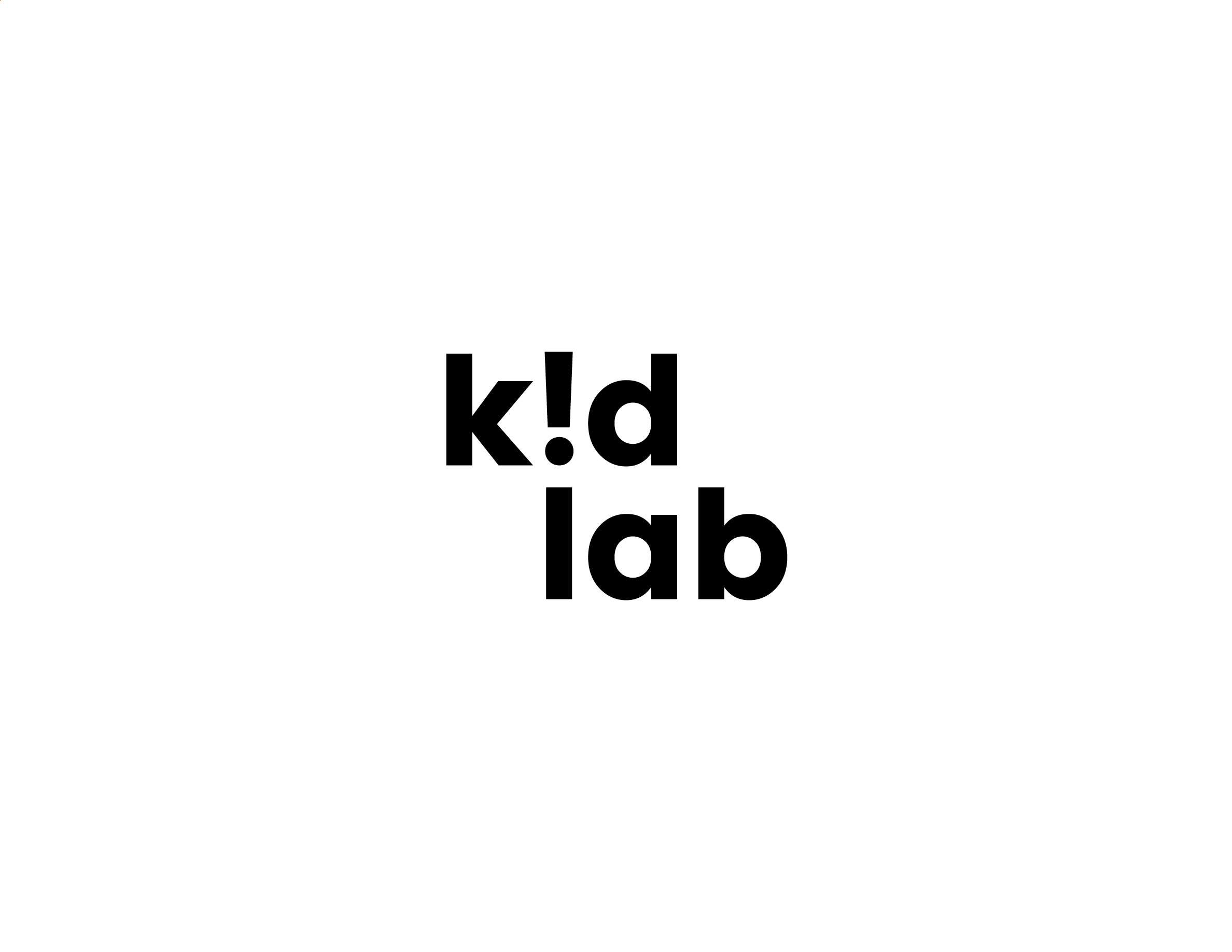
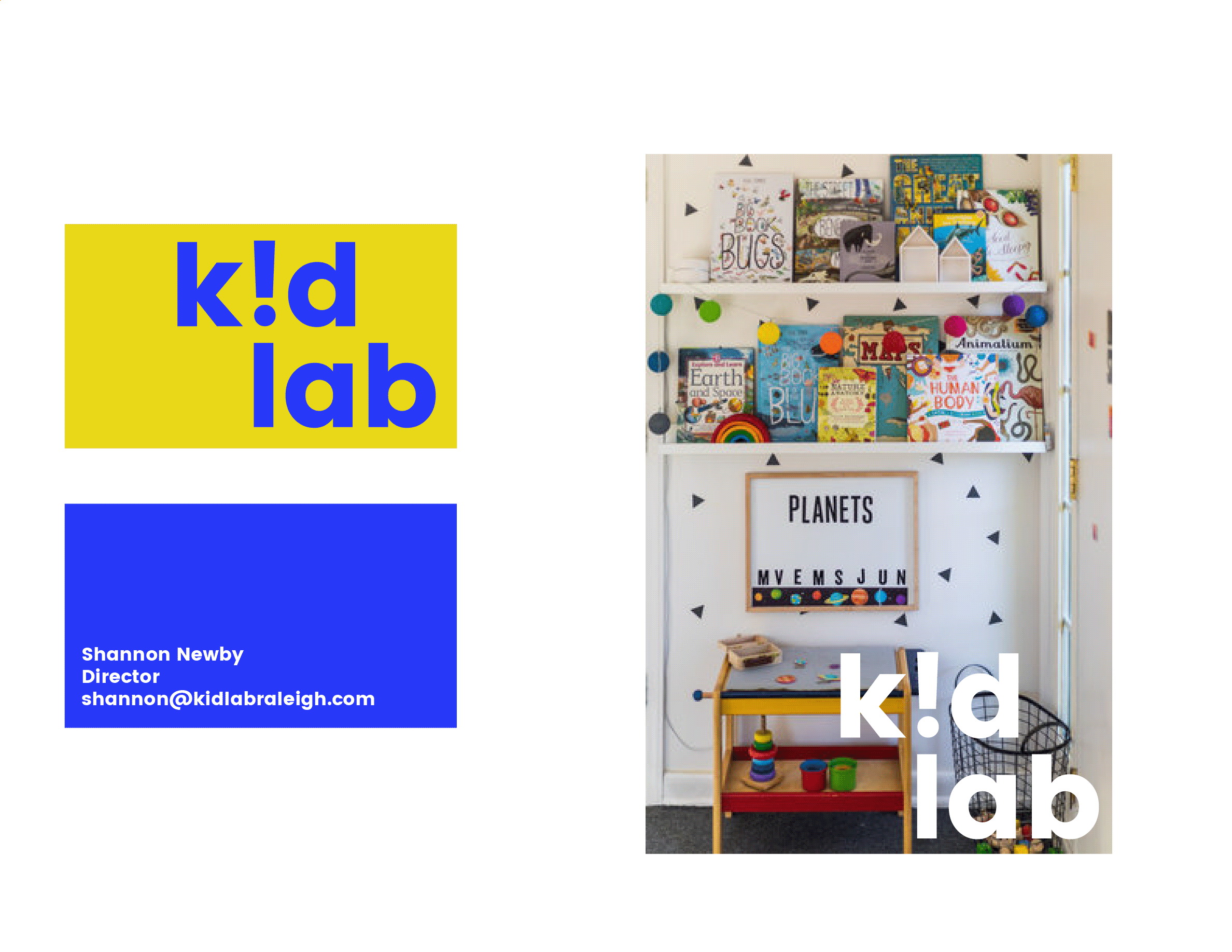

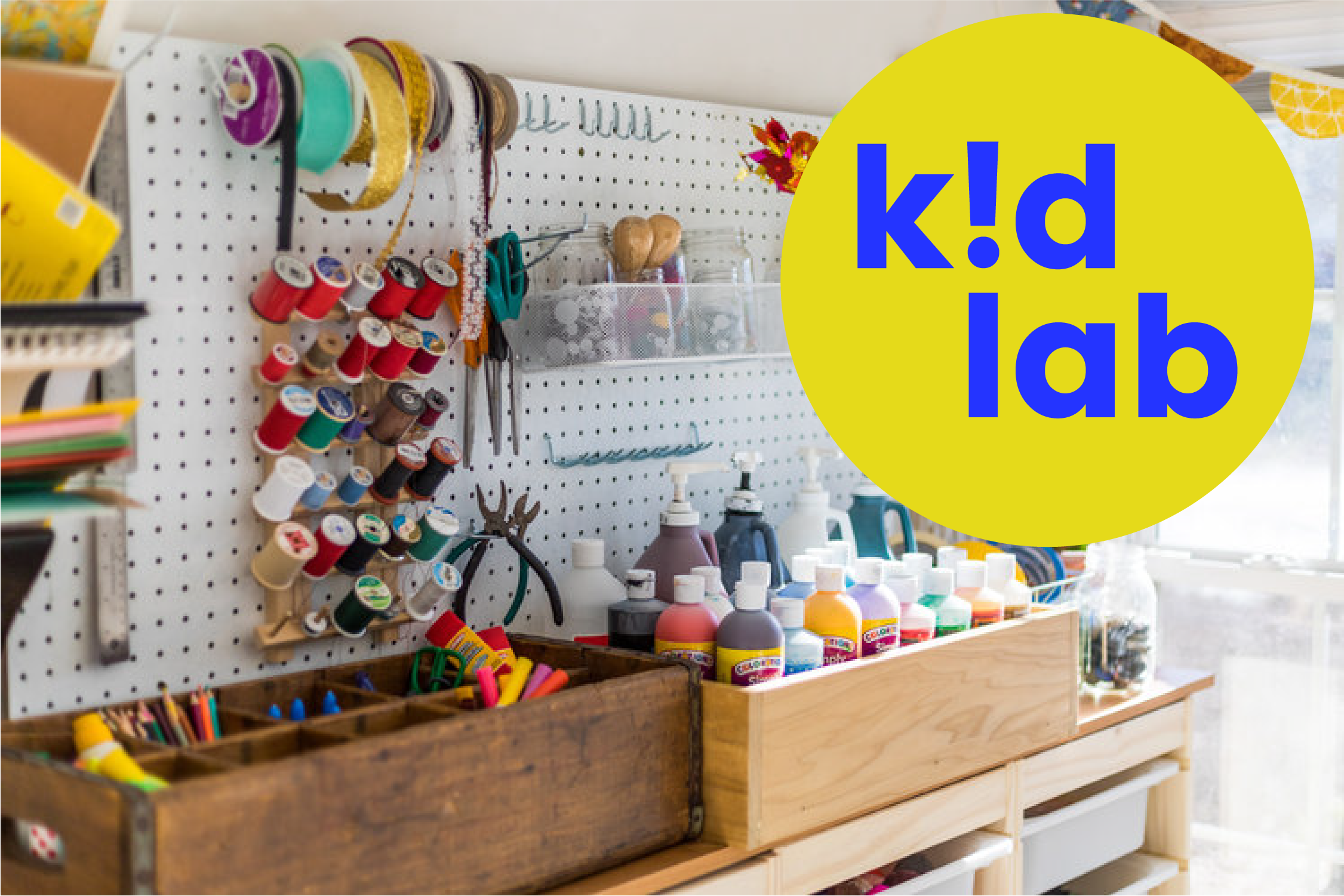
The final logo was set in all lowercase type, with an exclamation point serving as an inverted i. In further brand exploration, the ! can take on a visual vocabulary of its own as a sub-mark, as a pattern, as a frame, etc., infusing the entire brand experience with the excitement of the moment of discovery as a child learns something new.
Results_
As a result of the brand strategy phase, Kid Lab walked away from this project with a clearer focus on their “why” and where they fit into the landscape of educational programming for children. Their new logo helped them establish a distinctive style and visually legitimized their non-profit so that they can reach more families and kids.