Case Study: Coaly Landscape Architecture
The owner of Coaly, a female-owned landscape architecture firm approached me to update her existing brand identity and re-design her outdated website. It was important that the re-brand incorporate some of the visual vocabulary of the previous brand, as Coaly has been operating locally for many years and has recognizable brand equity. The original Coaly wordmark heavily featured the iconic Fibonacci spiral, a visual theme we carried into the re-brand.
Discovery & Brand Strategy_
The strategy deck that was presented to Coaly.
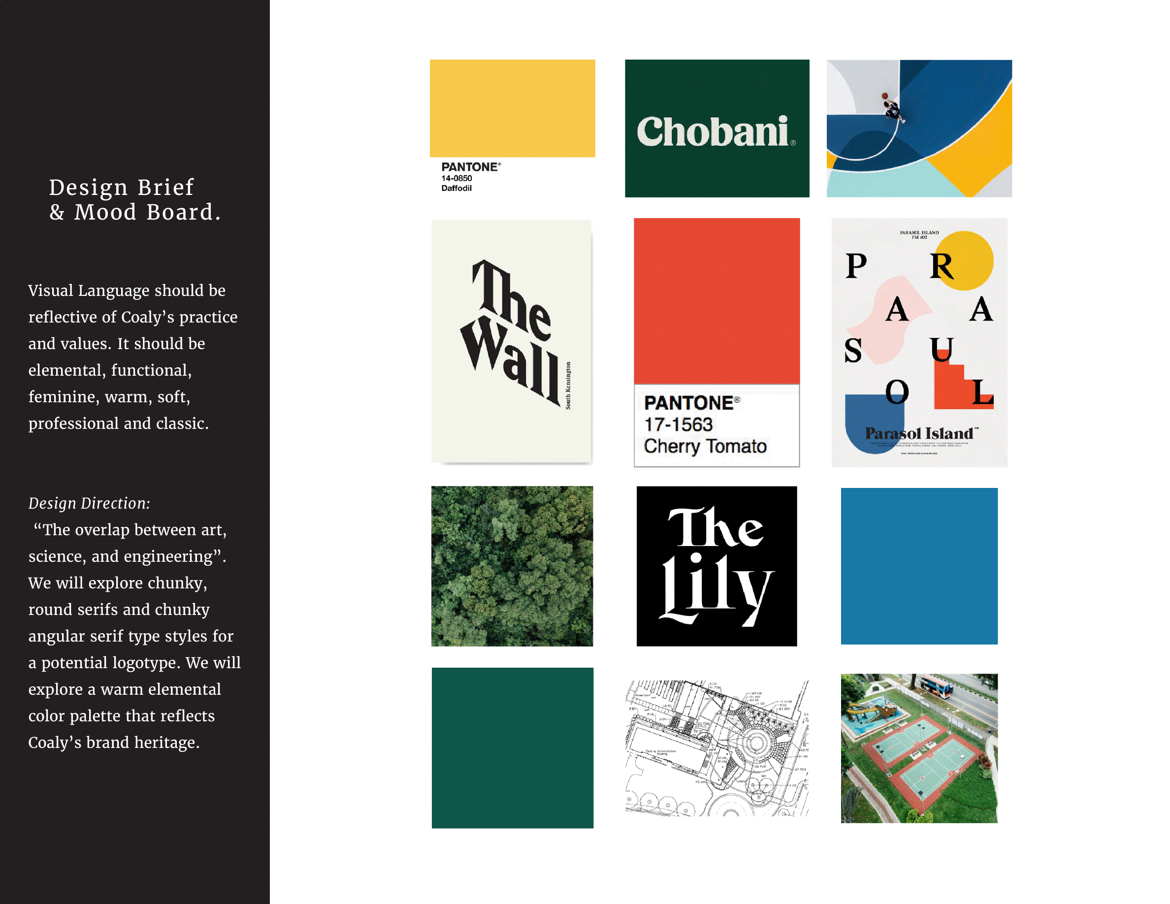
One of Coaly’s unique selling points is that it is a female-owned firm in an industry heavily dominated by men. Coaly’s work intersects the scientific and mathematical with the creativity and unpredictability of the natural world. This tension created an interesting design opportunity to balance order and chaos. It was also important that the visual language reflect the owner’s femininity, as she took special pride in her trailblazing career.
The design direction indicated that a possible solution would be angular yet feminine typography matched with organic shapes, natural textures, and a warm, elemental color palette referencing Coaly’s original brand identity.
Logo & Brand Identity_
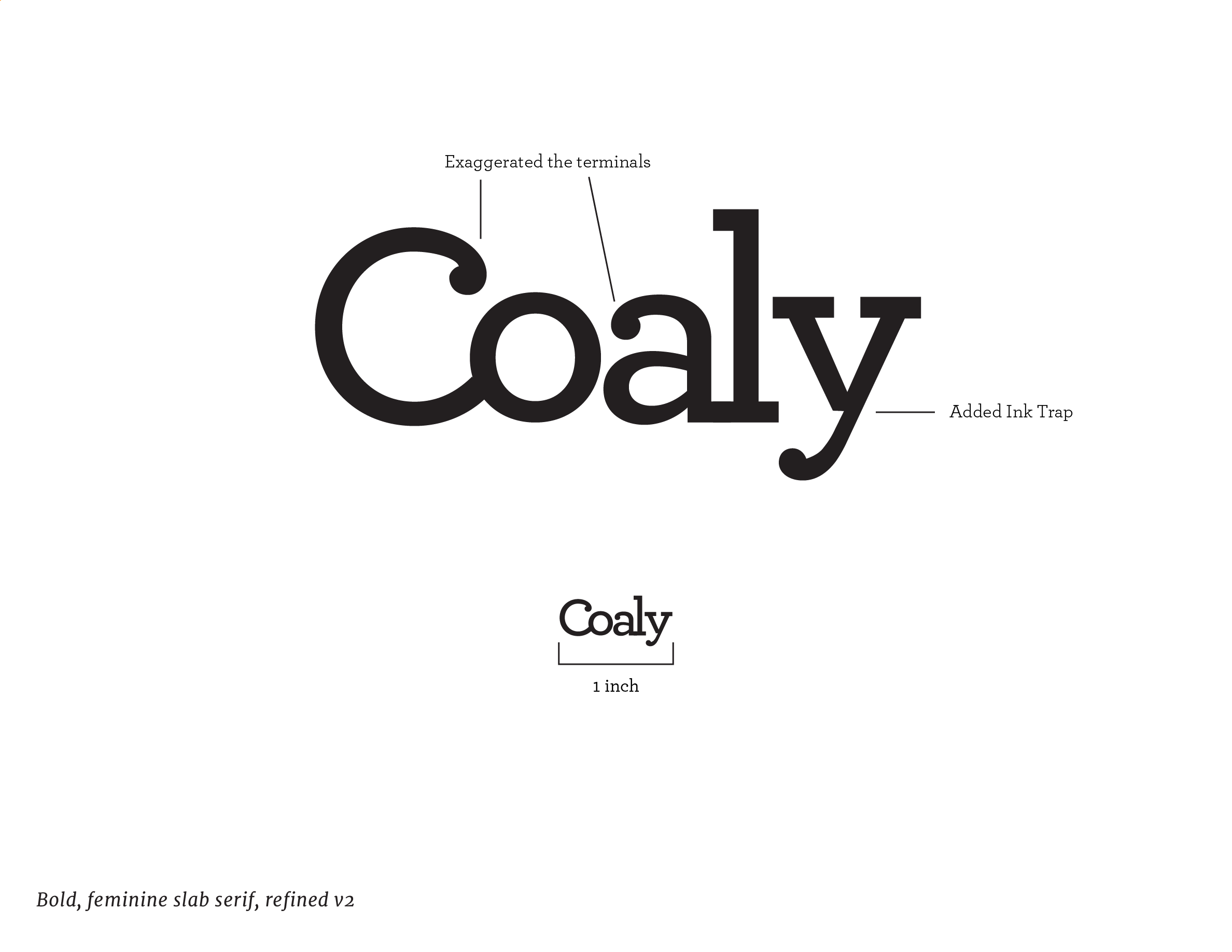
The final logo utilized the curve of the Capital C with an exaggerated terminal to reference the Fibonacci spiral from the previous logo, seen most prominently in the sub-mark badge. The wordmark is a balance between rounded terminals and angular serifs.

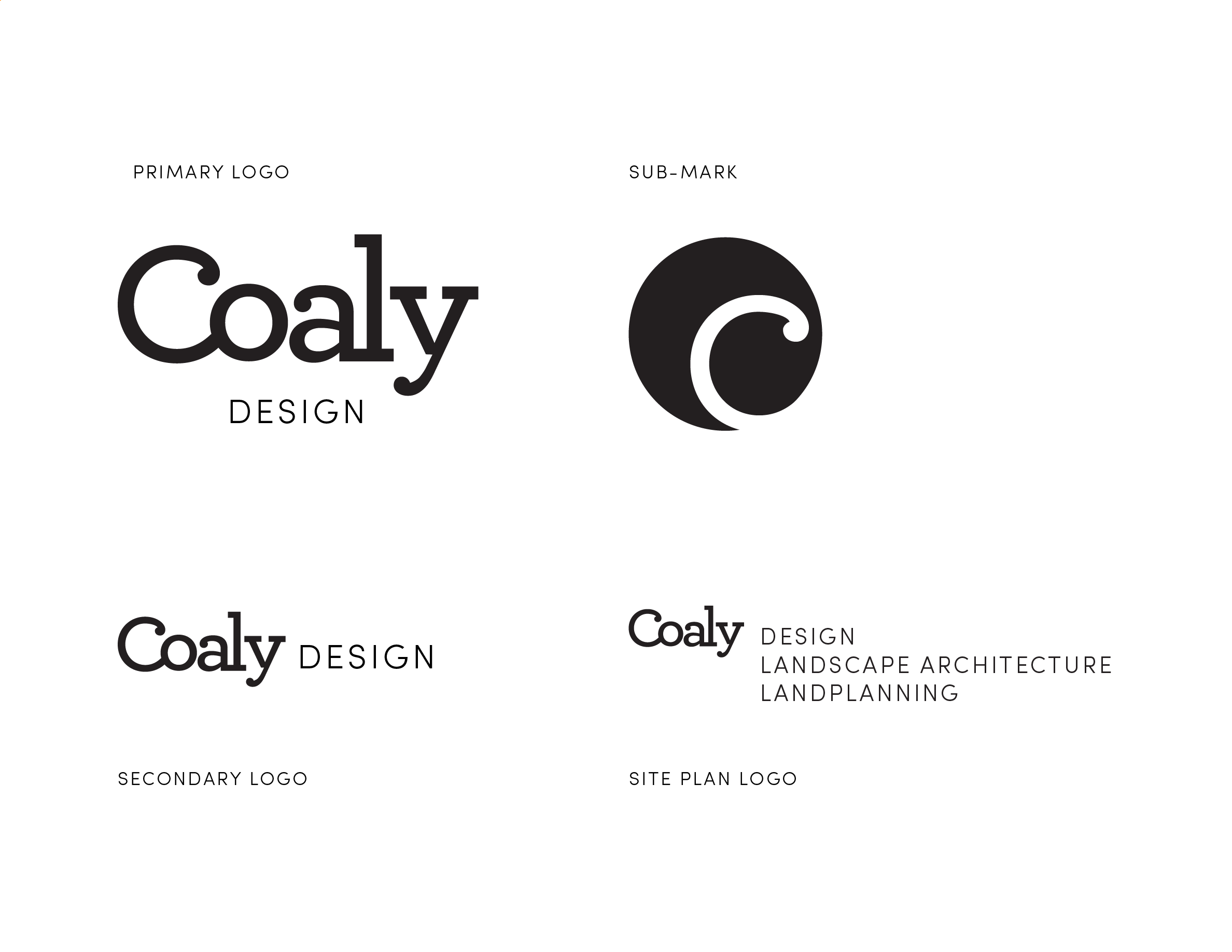
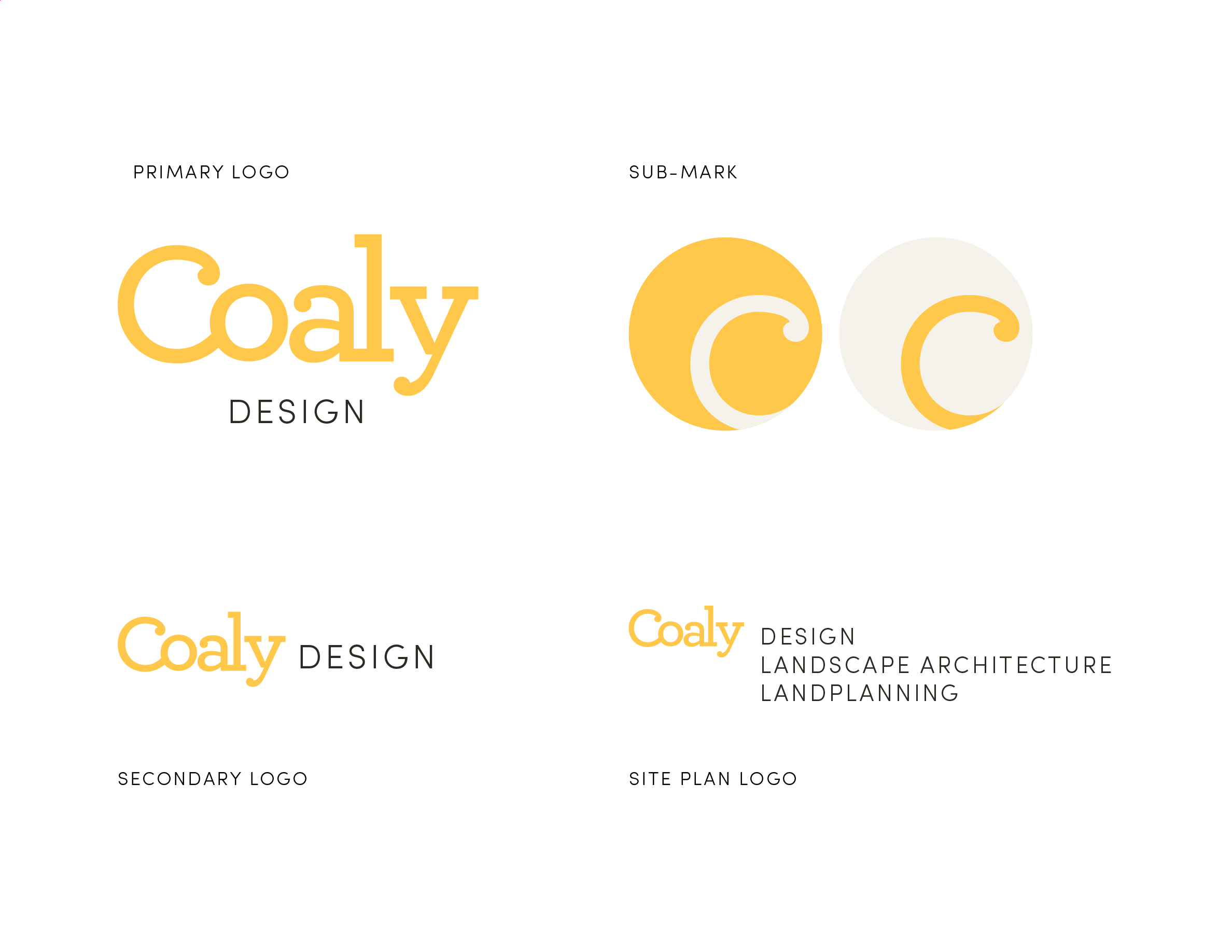
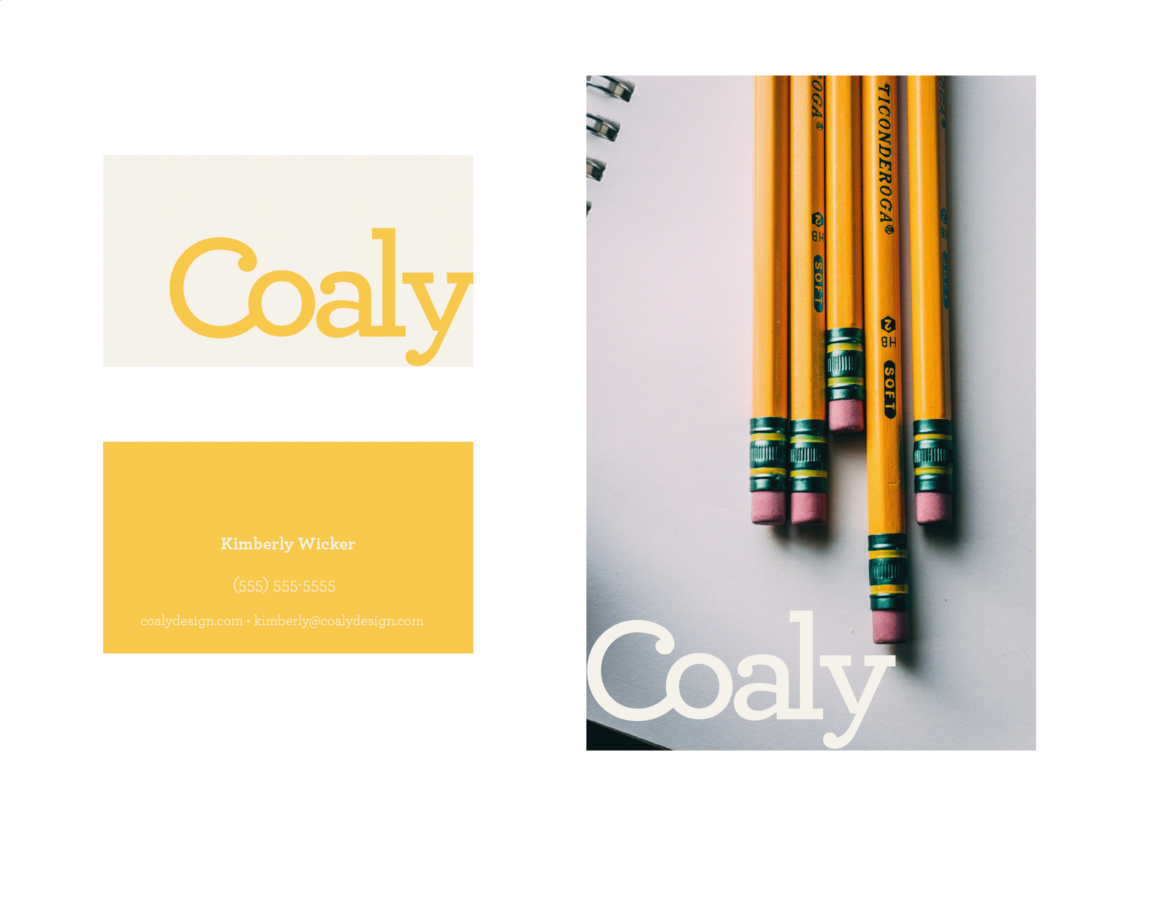
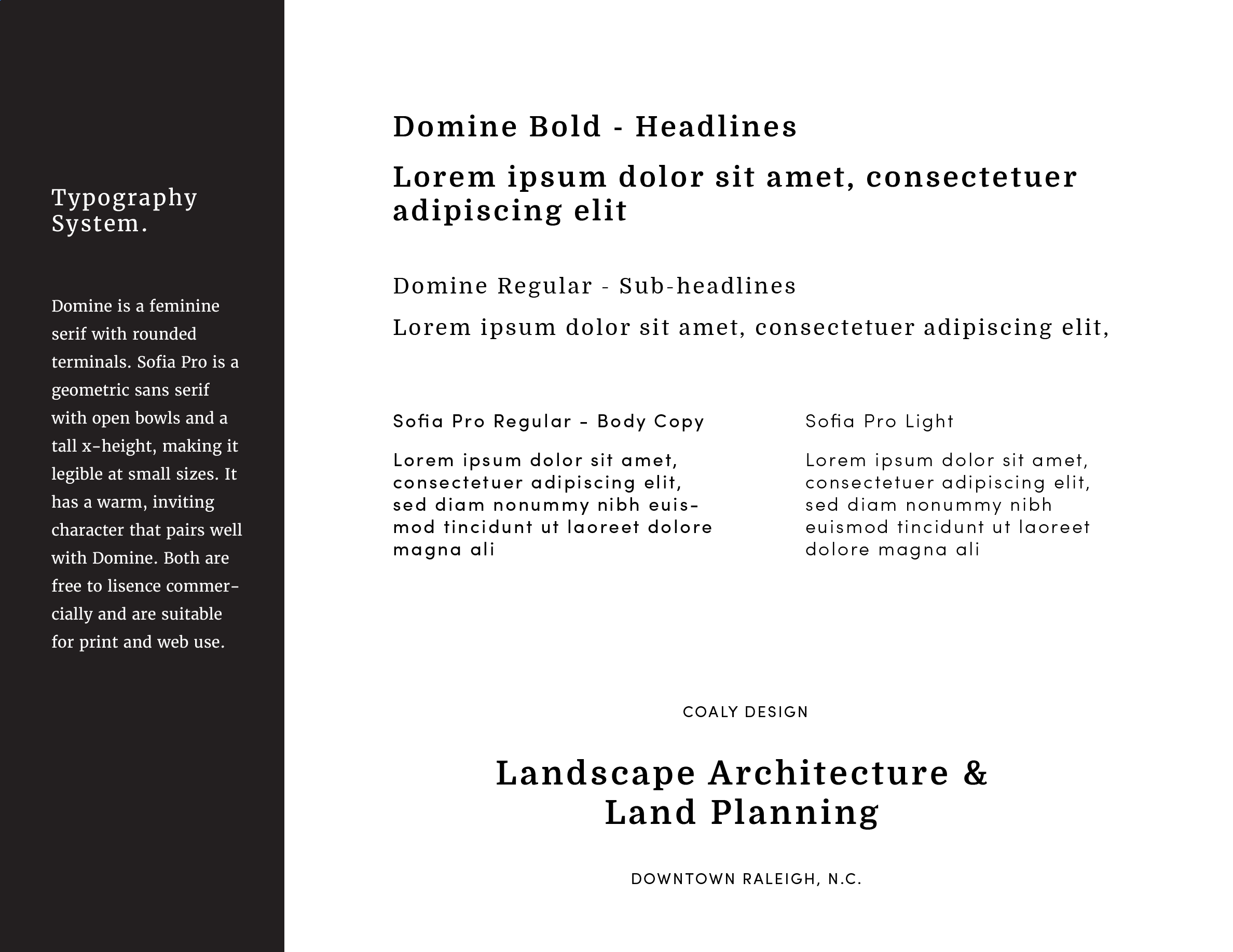
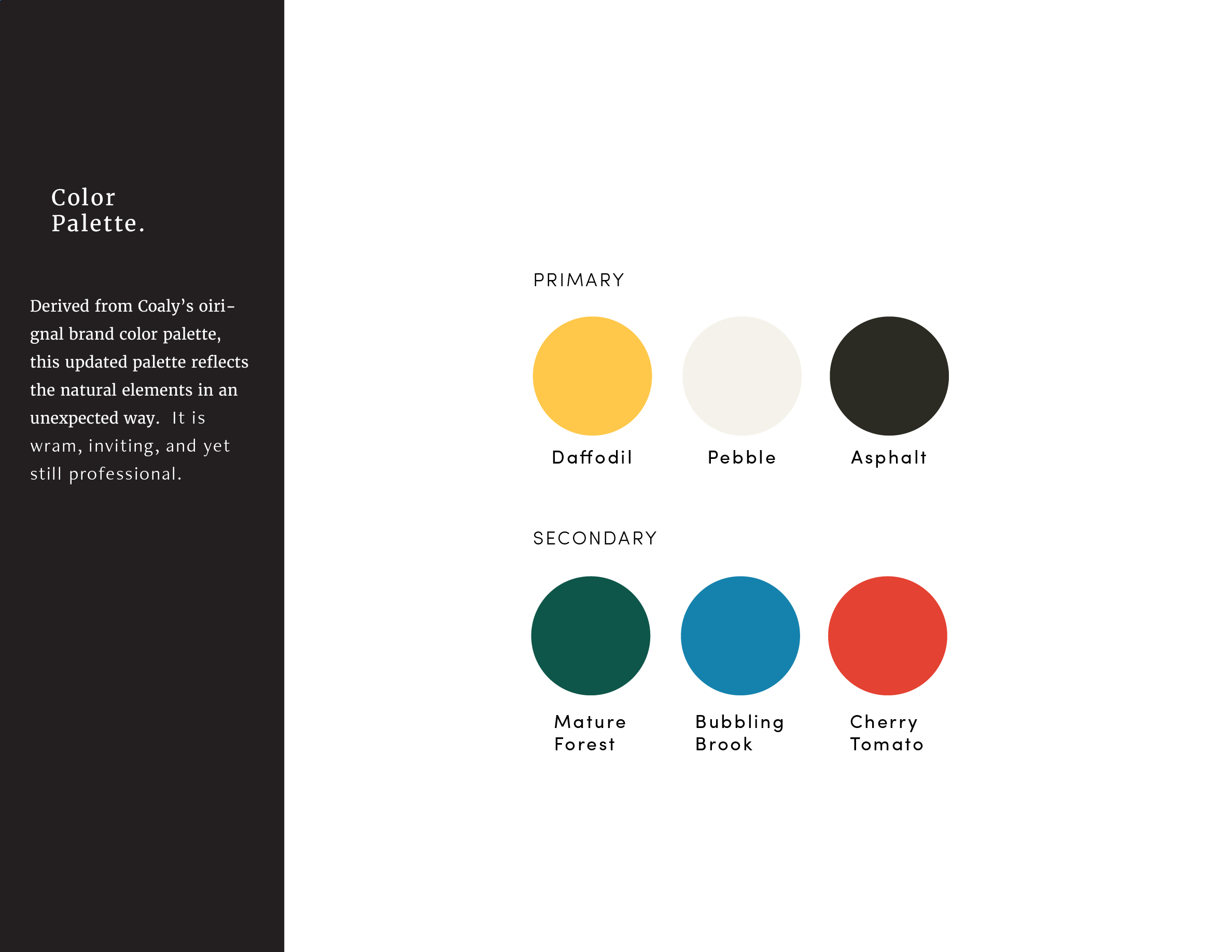
The final color palette referenced the elements of the Earth that Coaly works with daily. The typography system is feminine yet strong.
Wireframe & Web Design_
Coaly had existing copy that they wanted to re-use in the new website, so we began with information architecture and wireframes built around it to ensure we incorporated her existing content cleanly.
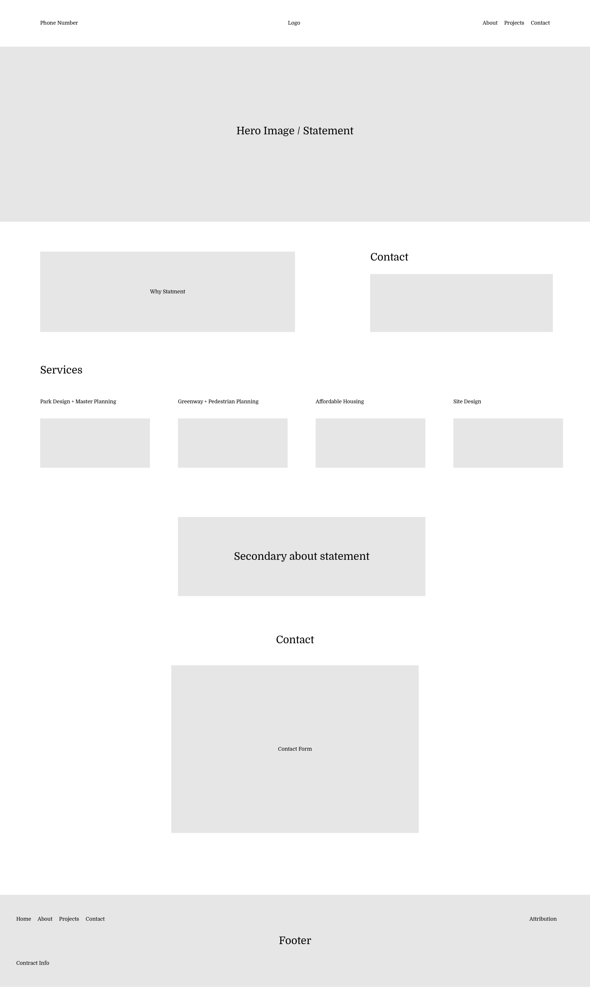
Home page wireframe.
We explored two different approaches to the web design, both appropriate expansions of the visual language, but emphasizing different aspects of the brand. The first was a solution leaning on abstract illustrations inspired by the aerial view plans Coaly draws for each project.
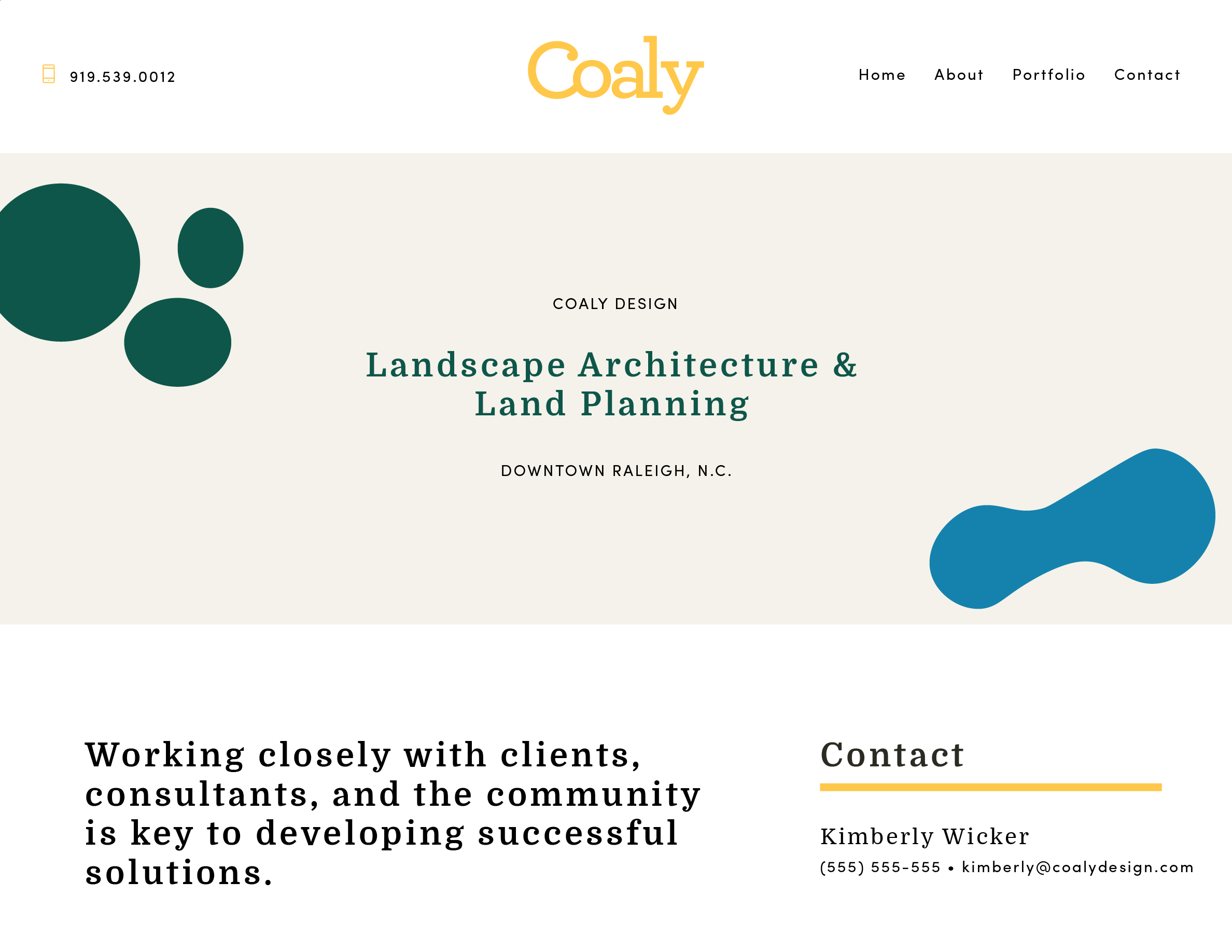
Illustration approach.
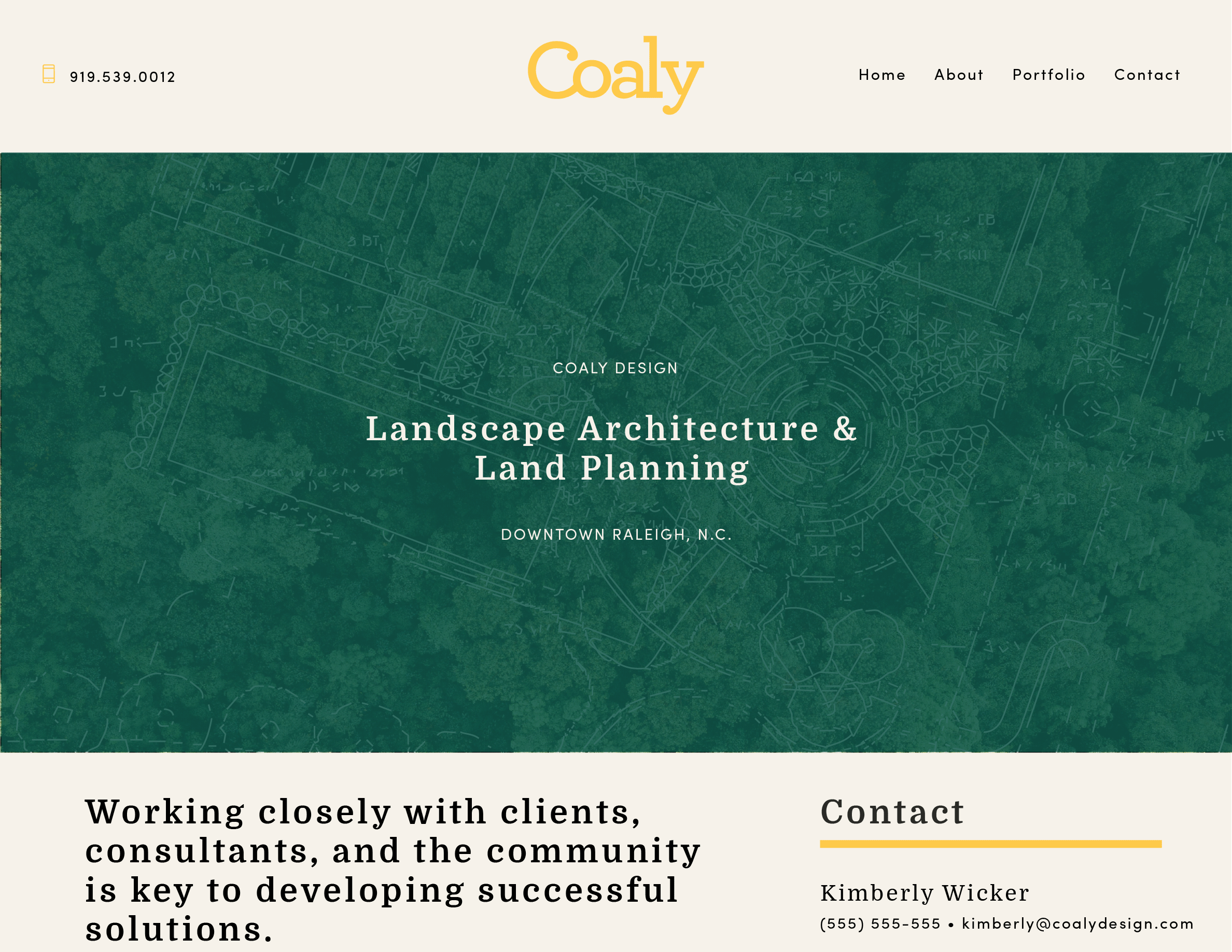
The final, winning design overlaid an actual drawing of one of Coaly’s most well-known projects—the Azalea Gardens outside of WRAL’s headquarters—on a textural aerial photograph of a mature forest, the signature landscape of Raleigh, North Carolina (aka the City of Oaks).
Results_
Coaly’s rebrand honored the existing brand equity, preserving the brand and name recognition the firm has built over the years. The fresh website has helped Coaly win new projects and continue working with some of the best developers in the area. The more feminine identity has helped Coaly stand out in a male-dominated industry.